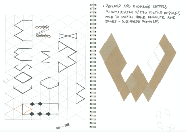
After exploring my chosen community and identifying what makes it different to other shamanic groups I started to think about the format of my campaign. I decided to create series of promotional posters, a banner and a short video to honour and celebrate Q’ero shamanic community. Having an awareness that type should be the most creative element of this project I began to experiment and to create letters. Inspired by their rhomboid textile designer I tried to build my type on the isometric grid pattern. First, I sketched some initial ideas and after I cut little diamond-shape pieces out of a cardboard sheet and built the first letters.
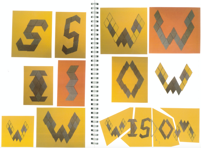
Then I tested the same letters in different shapes, backgrounds and colours too:
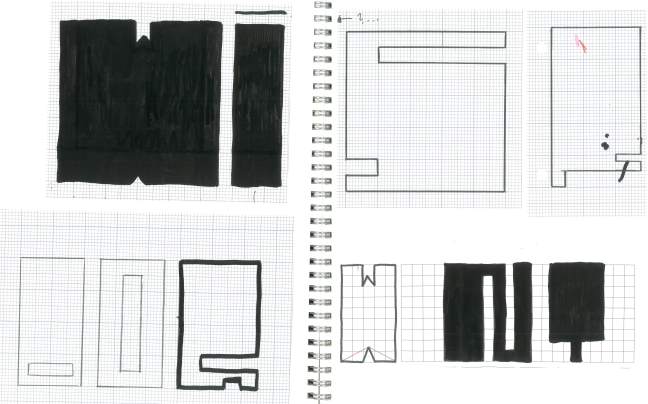
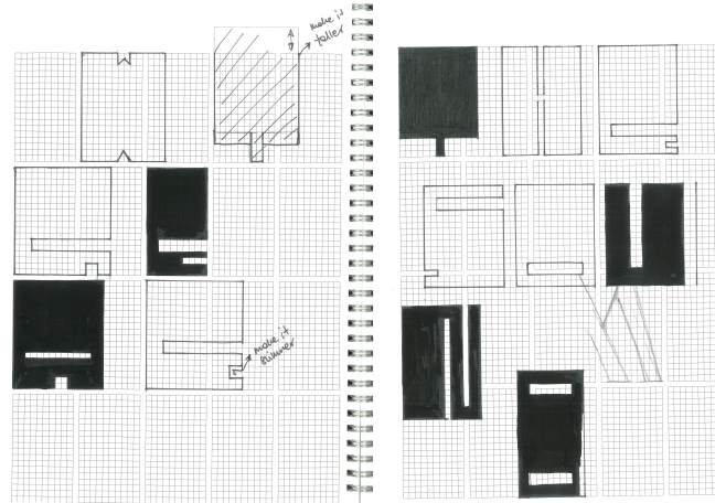
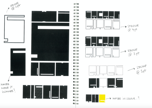
However, I decided to not to follow this idea as I did not quite like the outcomes. Such shapes reminded me of some of these typefaces used on heavy or black metal music promotional accessories and this was not what I intended to achieve. Therefore, I started to apply a different approach to the type design again. I sketched some bold and solid letters aiming to better reflect Q’eros strong and long-established practices. The angular and sharp-cornered features of it meant to echo their traditional textile symbol designs too.
I was happy with the new outcomes so, I took my sketches further and created first poster slogans with a pen tool in Photoshop
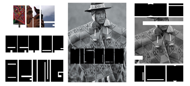
After, I began to incorporate images to it and tested some first poster designs
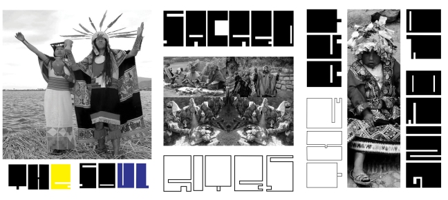
Overall, through the poster slogans and imagery used in this project I intended to celebrate and reflect Q’eros thankfulness for the natural world, their way of living and their long-established sacred traditions and ceremonies inherited after Inca civilisation.
